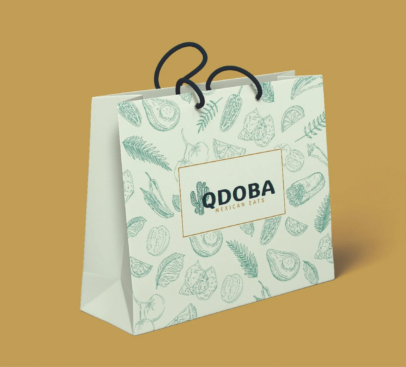
From creating a new Qdoba trademark to conceptualizing a food truck with a detailed mockup, the rebranding process was comprehensive and creative. Throughout the process, I focused on maintaining consistency across all elements of the brand. It was essential to ensure that each design piece felt connected to the brand's core identity. At the same time, I wanted to avoid making each component feel entirely separate or disconnected. Balancing innovation with brand unity is key when reimagining a company’s image.
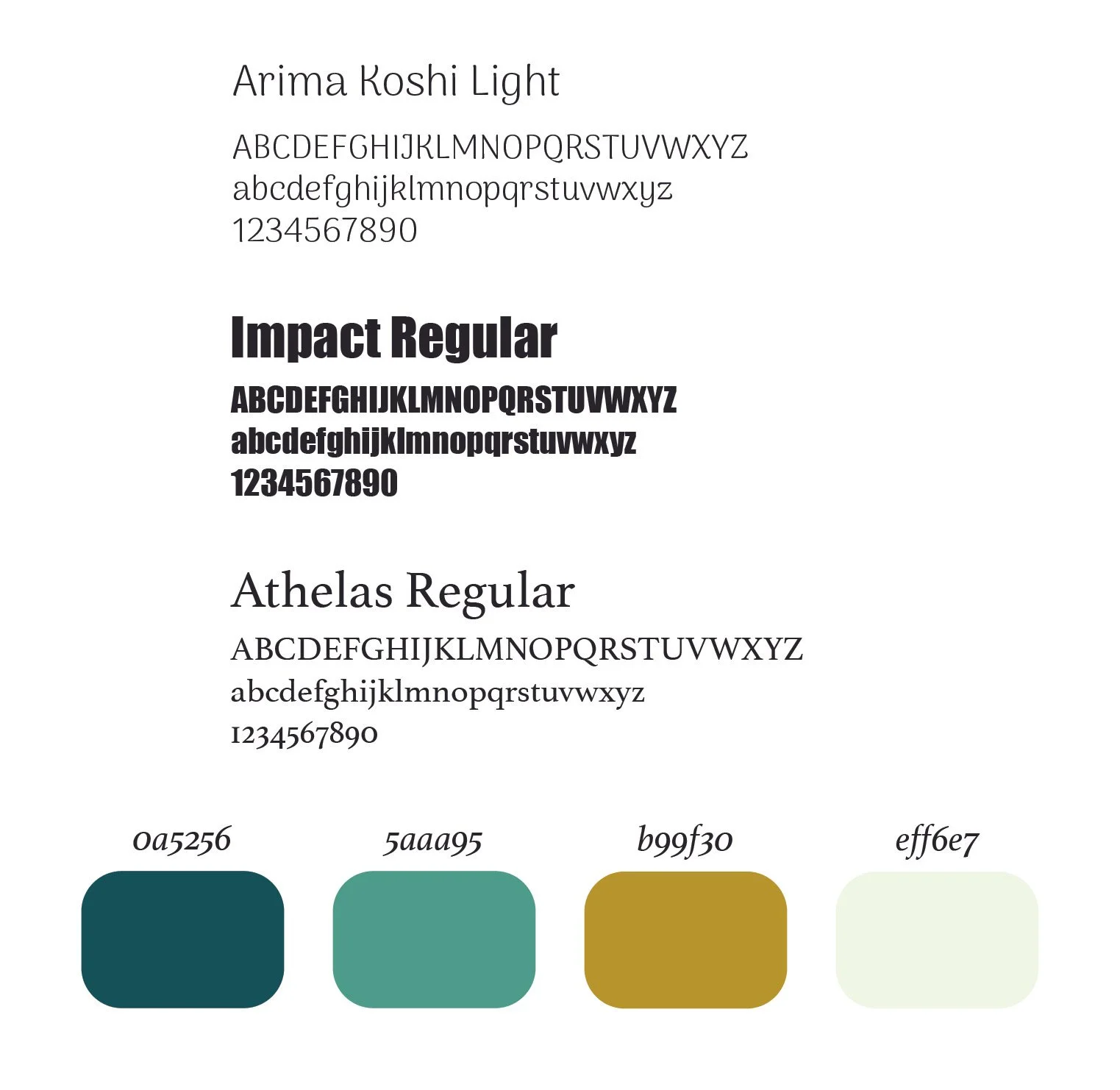
I limited my design palette to four colors across all projects, ensuring consistency and strengthening the brand's identity. To maintain a cohesive look, I used just three fonts throughout. One font was applied consistently for the envelopes, business cards, and letterhead, keeping these essential materials unified. The remaining two fonts were used for the brochure and menu in my food truck, adding variety while still aligning with the overall brand aesthetic.


